Have you ever seen red walls in a hospital? Probably not. Usually they are painted in pale colours. This helps the patient remain emotionally stable and feel safe. Take a look: all the colours of man-made objects we see around us are not chosen by chance. How does this relate to media traffic buying? Now you’ll see for yourself.
You’ve probably heard that colours can influence our emotional state and visual perception. We all have what’s called “colour memory” which helps us associate objects with a particular colour.
For example, could you imagine the Lego logo as blue and McDonalds as green? Or a Pepsi with a yellow label? We don’t imagine you could.
Brand colours are part of their identity. Together with other elements, they are imprinted in the minds of consumers. In this article, we’ll show you how marketers choose colours for branding and promotional materials, so that you can use these approaches and rules in your own creatives. Try them out, and your advertising campaigns will become even more effective🙂
The Psychology of Colour in Marketing
In marketing, the psychology of colour is used to catch the attention of the audience, subconsciously provoke certain feelings and emotions for the brand, product or other object of advertising. It would be much easier if you could just use the right colour. Unfortunately, when you’re working on a creative or branding, you need to do more than just be guided by associations and wait for it to work. Colour is part of the image. If a consumer forgets the name Fanta, they will certainly remember the word “orange”. Every advertiser need to aim for this result. However, this is only possible if the colour perfectly fits into the context.
Let’s take a look at what colour means in marketing. Look at the creatives and listen to your own feelings. Do they evoke the emotions they should do? Are they associated with the offer? In the long-term, this will also help you analyze your own visuals – by combining the conscious and the unconscious. So, let’s get a move on!
1. Red, of course, is first up! It symbolizes urgency, leadership, power, energy, and perseverance. The same colour is also used in creatives, as a symbol of passion or threat, for example:


Advertisers and marketers know well that red encourages decisive action, and spontaneous purchases. Therefore, red is most often used for the CTA button – “Buy”, “Order”, “Promo!” etc..
2. Yellow is directly associated with the sun, warmth, optimism, happiness, and harmony. It is often used in promo materials for tourist companies and fast food. Yellow is used in large quantities in gambling creatives. It subconsciously makes the consumer of feel the joy of a possible win and experience such a situation in their minds. In real life, yellow is often used as a warning colour, so in anti-virus advertising it also works well.
3. Orange is associated with energy, lightness, health and calm. In e-commerce, it is used to advertise pharmaceutical companies and products, as well as toys and products for children. Orange is usually involved in creatives for gambling and sports facilities.

4. Green symbolises harmony, environmental friendliness, freedom, cleanliness, healthy lifestyle, lightness, harmony, and internal balance. A lot of green is used in creatives for nutra, cosmetics, products for proper nutrition and goods where you need to emphasise the natural ingredients. Green also helps you to concentrate. That’s why snooker tables are green. It is used in creatives for smartphone cleaners and boosters, since it symbolizes how effective the cleaning is.

5. Blue and its shades create a sense of calm, relaxation, trust, and peace. The use of blue in promotional materials instils a sense of reliability, stability, and comfort. We meet blue in verticals such as finance and betting, car and medical services advertising.

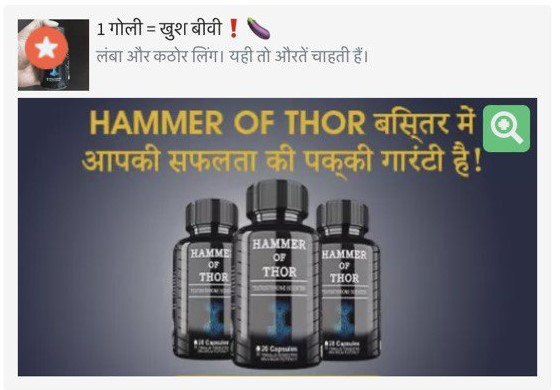
6. Black and all shades of grey are noble colours. They symbolize luxurious life, power, a sense of style, and classics. Black is suitable for advertising a status car, branded watches, and expensive perfumes. It’s also suitable for creatives for trading offers and adult nutra products for men.


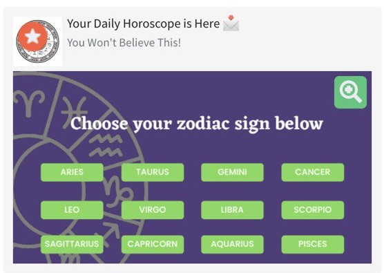
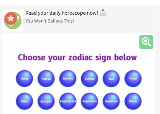
7. Purple is a cosmic colour, it helps to create an atmosphere of mystery. It is most often encountered in astrological offers, horoscopes, Tarot reading and other predictions.
8. Pink symbolizes romance, lightness, playfulness, sexuality, and frivolity. It’s suitable for advertising products for women (including 18+), underwear, and dating resources.


9. White symbolises sterility, innocence, cleanliness and personal care. In advertising, it is often used as a minimalist background to emphasize the form and details of the object. In commercial sites, you see a white background in creatives showing equipment, clothes, and medicines. It’s a good match for any other favourite colours. However, in some verticals, white can be dangerous because it can cause boredom and indifference. White is definitely not for betting, gambling and crypto!

10. Brown – symbolizes reliability, comfort, maturity, comfort, and conservatism. It is associated with advertising coffee, chocolate, and furniture. It is in most often used in such promo materials. There is a nuance that brown has many shades which can be dangerous for creatives. Sometimes it is difficult to choose one that will cause the right emotions for the consumer and not be associated with dirt.
What is important when choosing colours in advertising?
Colour itself in advertising will not give the desired effect. The final decision takes many factors into account.
Colour should confirm:
- To the product or business line. Can you imagine advertising a wedding dress salon in pink tones? It would look ridiculous, even though many people associate pink with romance. Chewing gum advertising is unlikely to be combined with brown, or chocolate with blue.
- Target audience – gender, age, interests, income level, and location. For example, in Europe, red symbolizes bloodshed, and in India – purity.
- Context – colour should harmoniously fit in with the overall visual of the brand or promotional materials, to avoid any visual dissonance with the consumer.
- The basic concept of the brand. If green is used in the corporate style, then advertising materials should have at least elements of green. Remember the association of colour with the brand?
- Creatives used by competitors. Everything here is a little ambiguous. You can analyze the promo materials in successful campaigns run by your “colleagues” or test your own which may well get “shot down”.
- Other colours in images and texts. Correctly combining colours is not easy, especially where you need to combine a range of different and bright colours. For example, in gambling, there is a very thin line between the “eye-boggling” creative and the right one. Look at the visual through the eyes of the user – is it annoying or does it make the user want to click?
P.S. Today you learned how to create even more clickable creatives for your profitable campaigns. Yes, this is not a decisive factor in the success of your advertising campaigns. But the psychology of colour definitely works and science should not be ignored. Everything can be useful on your road to profit. So, arm yourself with a colour palette to help you make creatives and landing pages that will leave your competitors far behind!