A proper landing page is a clear structure and offers an individual approach to the target audience. There are advertising formats where the landing page is the only way to maintain the user’s attention and lead them into taking the target action. For example, Direct Clicks. This is a mechanism similar to Popunder, where a special script redirects users to the landing page. There is no need for any creatives here, but a selling landing page is a must.
In order for your landing page to perform properly, you need to know the basic technical requirements for a single page and look at it through the eyes of the user. How can we combine all this and make a landing page which is suitable your offer? We’ll give you the answers in this article.
What is a Landing Page?
“Landing page” means exactly that, the first page a user “lands” on. An ineffective landing page is one of the reasons for low conversion. No matter how powerful the CTR is, users will not be converted into leads, if the landing page doesn’t grab them.
What is the difference between a website and a landing page
A landing page differs from a fully-fledged site:
- It has a simple structure with just several mandatory elements (data collection form, CTA button, catchy title, call to action). There should be nothing superfluous to distract the attention of the visitor.
- There should also be a clear focus on a specific offer. All the elements here lead smoothly to the target action, focusing the user’s attention on a single product, service, or company.
- It has a short-term value – it helps to generate leads only here and now.
- Low costs — compared with a fully-fledged site, a single-page selling site will cost much less (if you use website builders based on templates).
- The minimum time spent on the creation of a landing page “from scratch” can be done in one day.
- It is light weight — something which directly affects the loading speed. If an offer page takes more than 2 seconds to load, potential leads will not wait and they’ll close the site.
Proper Landing Page Structure
The main and only purpose of landing is to obtain user data. Therefore, it usually makes no sense to make more than one url for it.
- The first or main screen of the landing page should catch the user’s attention, impress and arouse their interest. If the user has started scrolling the landing page, it means that the task has been achieved.
- On the second screen, the owner of the offer can tell about his project, company, product, employees and brand history, as well as prices. In order to enhance confidence, photos and videos are welcome here. Remember how heavy the page is.
- On the third screen, it’s a good place for a clear and understandable list of benefits, advantages, and to resolve any objections. It’s easier to lead the user to the target action, if you can explain what it will give them, how his or her life will change, and what “problems” will be resolved.
- The fourth screen is the place for reviews, certificates, success stories, thanks, and partners. This is the so-called “trust block”. It demonstrates to the user that your offer is a “one-day wonder”, but a serious brand.
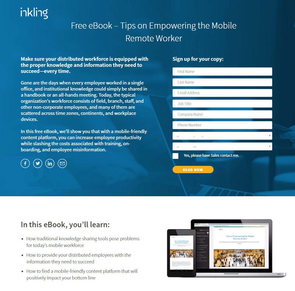
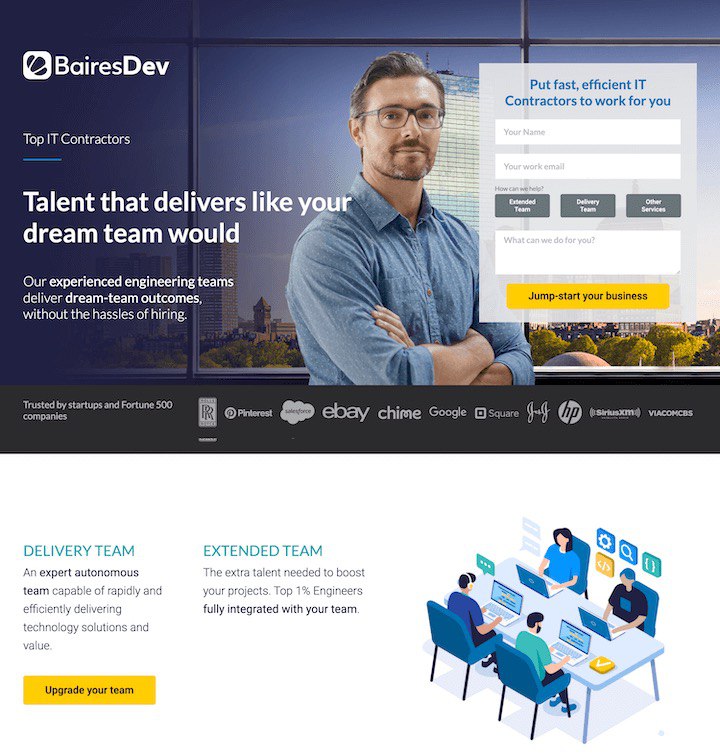
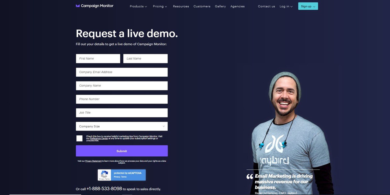
- The last screen contains a form for registration, ordering goods, making a deposit, subscribing, and making requests. The last page needs to contain a call to action button, contacts, and a feedback form.
Ideally, the landing page should look like this. However, the length of the landing page can actually be measured in anything from two to twenty screens.
In practice, advertisers restrict themselves to just a few screens. Many believe that users will not stick around to the form, so they try to squeeze everything into one screen all at once.
However, you can look at it from the other angle: the more information you give your users, the “warmer” they will be when they actually reach the registration form. Users who are disinterested and disloyal will close it immediately. Only the highest quality audience will stick around to the end of the page, ready to make a targeted action. If you don’t intend to use a prelanding page, a long landing page over several screens will help your warm up the traffic.
Examples of landing pages
In order to help you understand what a good and bad landing page looks like, here are a few examples.
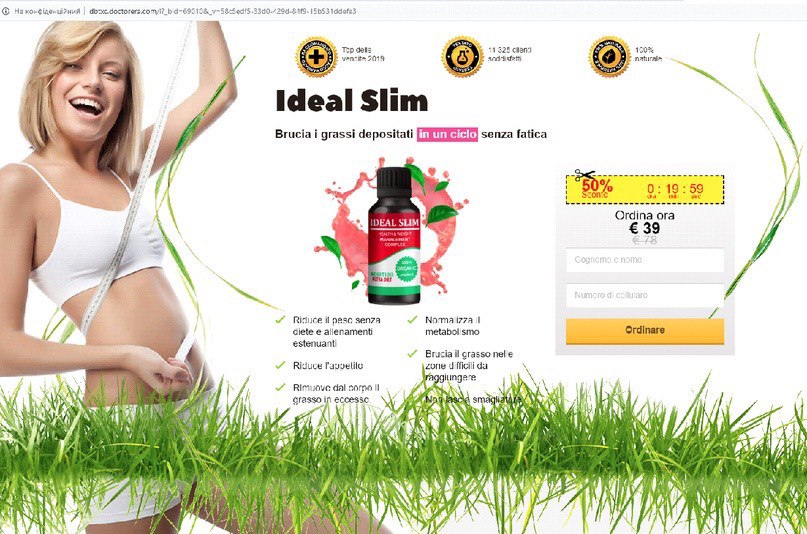
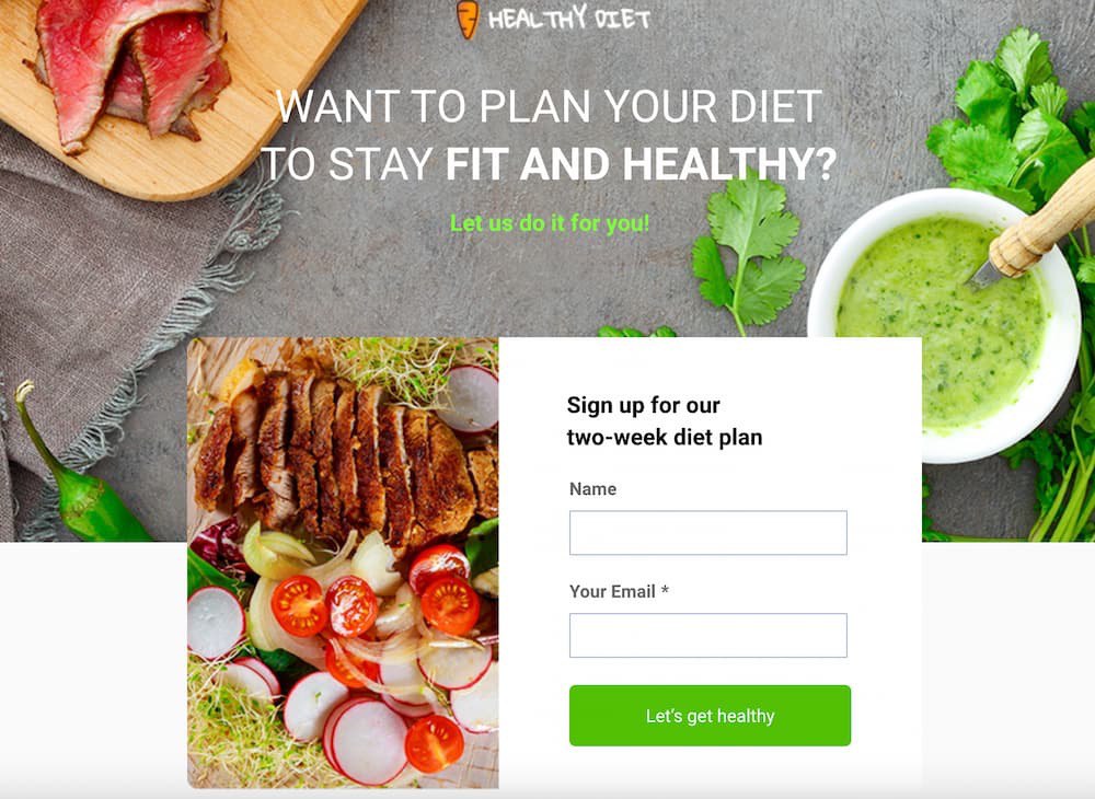
Such landing pages are likely to bring conversions – they have both triggers and the right CTA button (“be healthy”) and a pleasant visual:
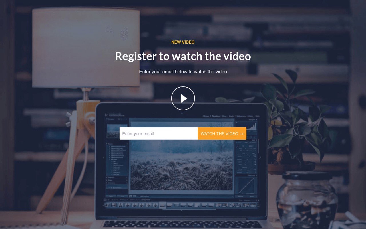
The following pages contain typical errors: the first is boring, in the second the registration form is too long, and in the third the last question might stress the user. Try not to make such mistakes.
When don’t you need a landing page
There are situations when creating a landing page is not appropriate:
- if the goal of the advertising campaign is to increase brand awareness.
- if the product or service being promoted is expensive, complex or unfamiliar to the audience.
Promoting a landing page in search engines is not viable, it only helps to increase the effectiveness of the main site. This is a lead generation tool for a mono-product, mono-service or event.
Rules for creating an effective landing page
Let’s move on to the basic rules for creating a selling landing page. Here we’ll give you a couple of life hacks from TacoLoco experts that you will definitely need.
So, to avoid exhausting your budget due to a weak landing page:
- Stick to the structure we presented above. Use benefit blocks, guarantees, reviews, questions and answers, photos and other information, depending on the characteristics of the offer and the target audience. All the same, you won’t achieve conversion without a data collection form, a button and a header.
- Don’t overload the landing page with information and images. First of all, unnecessary information easily distracts the user’s attention. Secondly, more media content makes the page heavier, and accordingly affects the loading speed.
- A catchy, gripping headline is half the battle. If the headline doesn’t grip the user, they won’t interact with the landing page. Just don’t go too far, try to avoid shocking headlines like “Do you want to know what you will die from?”etc.
What is a correct headline for a landing page
Adhere to the working formula for creating a successful landing page header:
- benefit of the target action (tell the user they will lose weight, get married, win a million, quit their job, fit into their favourite jeans two sizes smaller);
- unique nature of the product or service (“a new way of banishing acne forever”, “you’ve never experienced dating like this before!”);
- “problems” + solution (“weight loss pills don’t work? try a fat burning patch!”);
- a clear time frame, but without false promises (“lost 20kg in 10 days” – bad, “a perfect face in 7 days” – good);
- promotions, special offers, discounts and other USPs are powerful triggers for landing pages.
- urgency – countdown counters on the landing page are a great way of increasing conversion (“one place left”, “time remaining until the end of promotion – 10:23:34”).
CTA button
A selling landing page always has a clear call to action. Its task is to guide the user, in clear and ambiguous words, to show what they must do to get the benefits. If the CTA (Call-to-Action) is not clearly worded, users will not understand what to do with this page and won’t stay around to find out. There may well be several CTA buttons on the landing page, but don’t place them next to each other, so as not to confuse the client.
In the CTA button, underline:
- the product itself: “try something new!”
- benefits: “Sign up for free!”
- advantages: “watch a new video!”
- urgency: “Join now!”
It’s better not to “push” a non-user with words like “buy”, “order”, “subscribe” – subconsciously they cause resistance.
How to choose images for a landing page
A visual landing page begins with an image. If the user is grabbed by the picture, they will decide to read the text, or close the page if they find it annoying.
- For landing pages, it’s best to choose large images that display the essence of the offer.
- Avoid low-quality pictures and primitive stock photos, this reduces the user’s trust.
- The image should look harmonious in the page layout and complement the other elements.
The success of a particular image for landing is difficult to predict even for professionals. If you want a high conversion rate, allocate time and budget for testing and optimization.
Why does a landing page not lead to conversions?
You feel that you’ve created the perfect landing page, but you’re not happy with the CR? There can be a number of reasons:
- a non-functional landing – the wrong structure, the individual elements aren’t converting or there is no connection between them;
- low traffic quality – an ineffective channel or an incorrectly selected target audience;
- there is simply no demand for this product or service at the moment or in the selected Geo. This can also happen, which is why you need to analyze the market and evaluate the prospects of the offer before launch.
There may be several reasons for low or no conversion. However, before changing the landing page, analyze the errors, try to fix them and test again.
What can we do with a bad landing page?
How can we identify that a bad landing page is the reason for low conversion? They may be plenty of clicks, but they’re not bringing leads. A high CTR indicates that the ad is working, the target audience has been selected correctly and the offer is promising. Still visitors close the landing page without completing the target action. What’s wrong?
- make sure that the essence of the offer is described clearly and understandably on the page;
- try adding “trust blocks”: expert opinions, reviews by media personalities, certificates;
- analyze the price level of the promoted product – even if you channelling foreign traffic, people are not always prepared to part with their money to make a spontaneous purchase;
- make sure that the information is presented in an accessible language, do not overdo specialised terminology;
- look at the landing page through the eyes of the user – do you understand how to order a product, make a deposit, subscribe or register, and what will happen after you leave your data?
- take another look at the landing page visual – is the image is too bright, relevant to the text, does the font look harmonious, etc.;
- if you are working with a product that’s new or difficult-to-promote or a prohibited vertical, use a prelanding. There’s a possibility of fewer transitions to landing pages, but the audience will be of higher quality and already “warmed” up.
Remember, for the user, a high quality landing page is an opportunity to discover the conditions and details of the offer. It does not matter where the traffic comes from – direct click, push (traffic with push notifications), banners or popups. It needs to be able to resolve questions from a “cold” and “warm” audience.
Some CPA networks provide ready-made landing pages, their effectiveness can be judged by the results of the test traffic. Therefore, if you see that landings pages are not converting – don’t waste any more time, make your own. Fortunately, you don’t have to hire a programmer for a single page, it only takes a day to create one on a template in Nethouse, Tilda or WordPress. Especially now that you know all the secrets of a selling landing page 🙂